Baby Name Pie Charts
In this part of lab, we will create pie charts using the baby name data.
As in the last section, we import pyplot to make all our pie charts.
import matplotlib.pyplot as plt
import numpy as np
Create a new file called babyPie.py. Choose a set of top 10 names from the file topNamesData.py. In our examples below, we use year1980F but you can use any set in the file.
Pie Charts
To create a pyplot pie chart, you'll need two lists:
- (required) A list of numbers indicating the size of each pie slice.
- (optional) A list of labels for those slices
Those two lists can then be passed to the pie() function.
Step 1. Extract the lists needed for the pie chart from the data
This is the format of the data file:
 year1980F = [
 (58379, 'Jennifer'),
 (35815, 'Amanda'),
 (33919, 'Jessica'),
 (31628, 'Melissa'),
 (25741, 'Sarah'),
 (19969, 'Heather'),
 (19913, 'Nicole'),
 (19832, 'Amy'),
 (19525, 'Elizabeth'),
 (19118, 'Michelle')
 ]
Your first step is to write 2 list comprehensions to extract the counts and names, respectively, from the data.
names = [                     ]
count = [                     ]
names is a list of names and count is a list of the counts of each name in that year. Once those lists are defined, then you can make a pie chart.
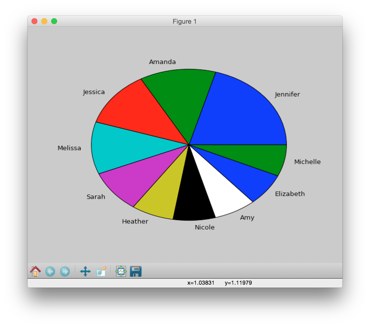
plt.pie(count, labels=names)will produce this:
Step 2. Use plt.figure()
Let's add some more structure by using plt.figure():
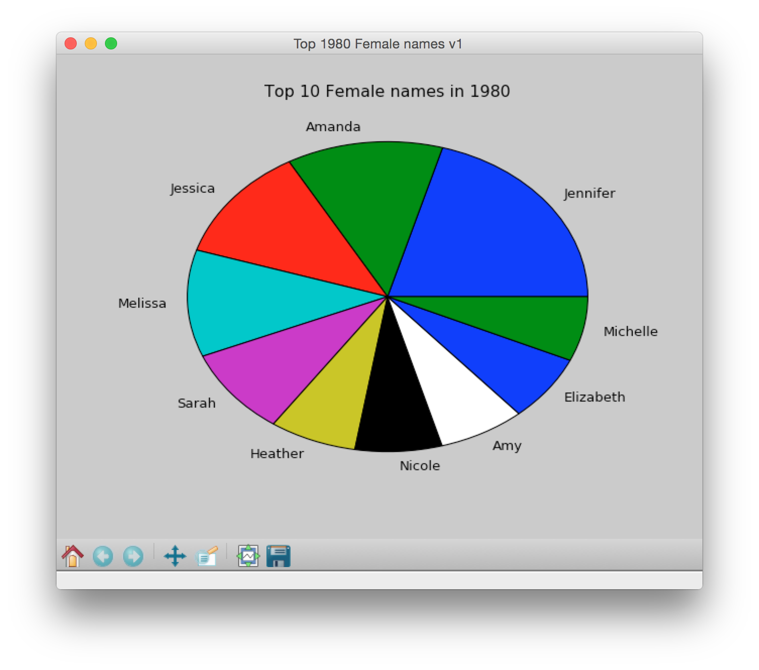
plt.figure('Top 1980 Female names v1') # put this plot in new figure window
plt.title("Top 10 Female names in 1980") # title as part of the figure
plt.pie(count, labels=names)
plt.show()  # see the plot
will produce this:
Note that for each of the remaining plots in today's lab, we create a new figure using plt.figure() for each plot. If you look closely, you will note that the titlebar of each figure changes with each successive plot. We recommend that you do the same for today, keep each plot in a separate figure window.
Step 3. Fix the squished plot and change figure color
See how our pie chart is not a circle, but a squished circle? We need to set the figsize so that the pie chart is a perfect circle. We'll also change the background color of the figure to be white (you can choose any color you like, see reference color link at bottom of this page).
What does figsize do?
plt.figure('Top 1980 Female names v figsize=(4,1)', figsize=(4,1), facecolor='white') 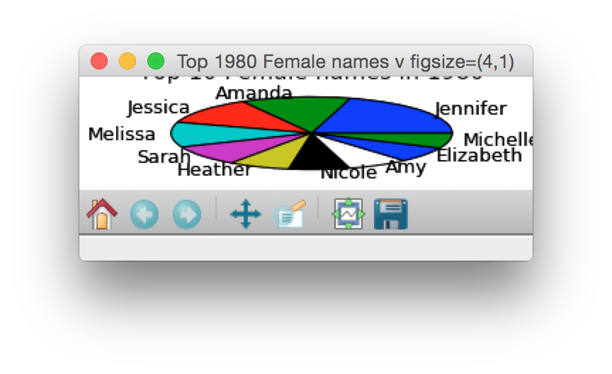
plt.figure('Top 1980 Female names v2 figsize=(1,5)', figsize=(1,5), facecolor='white') 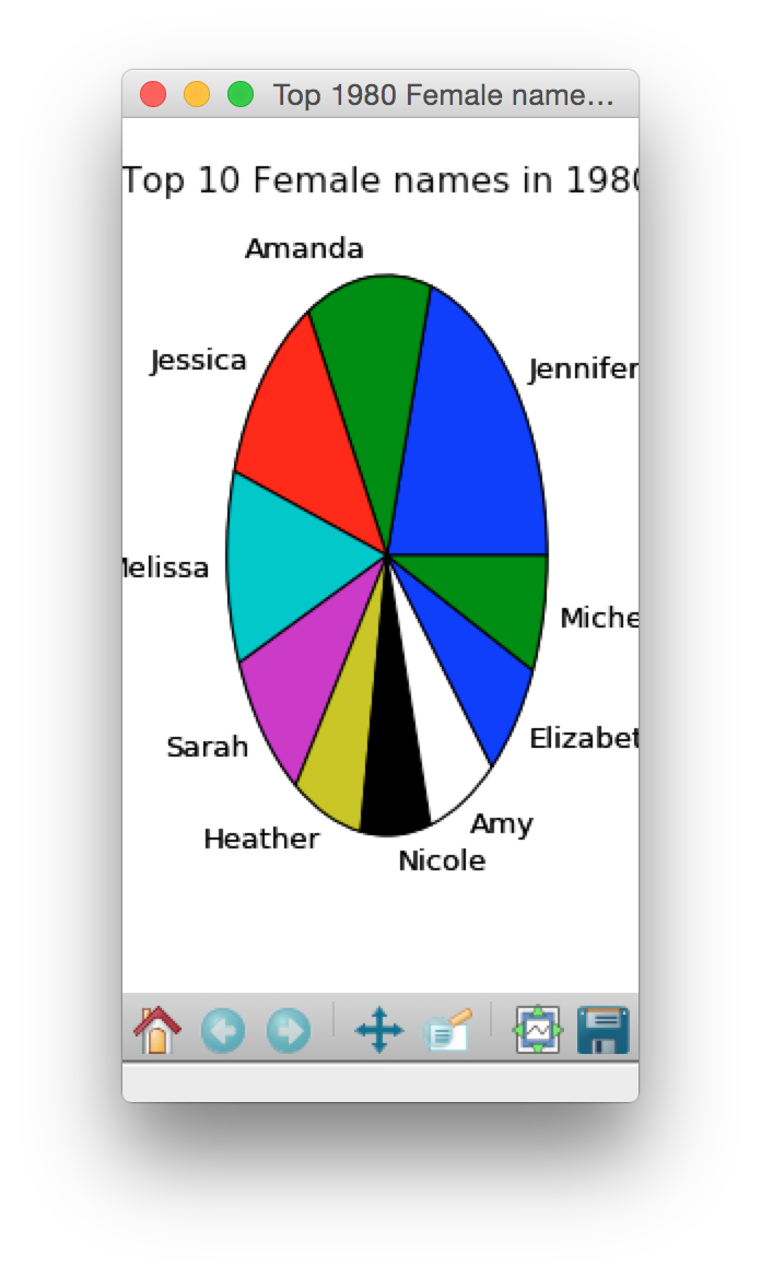
plt.figure('Top 1980 Female names v2', figsize=(4,4), facecolor='white') 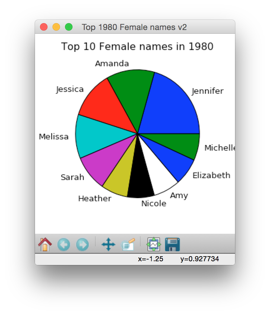
Adjust figsize so that all the names are entirely displayed
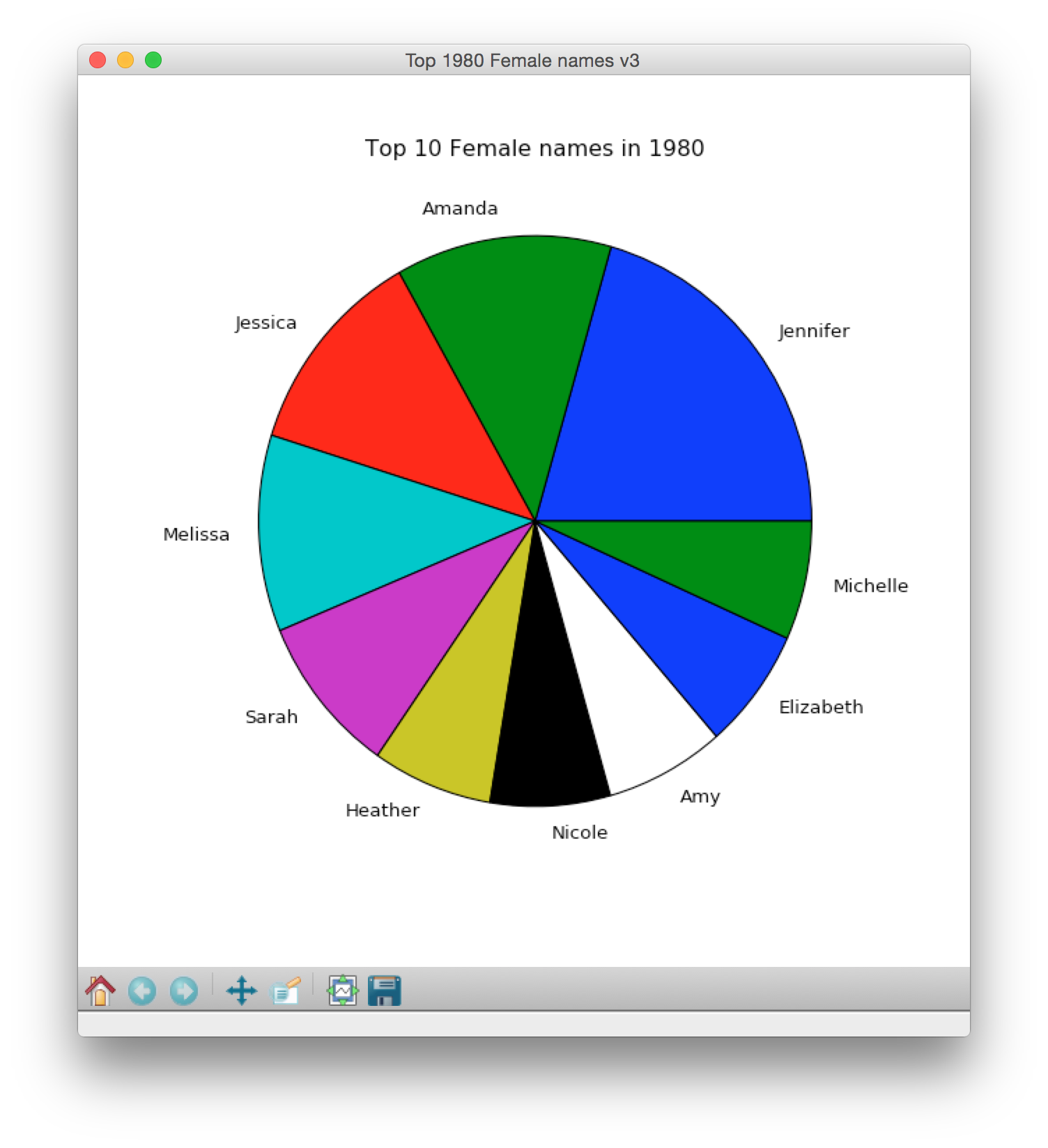
Step 4. startangle
By default, all pie charts start at 0 degrees (cyan lines added to show degrees):
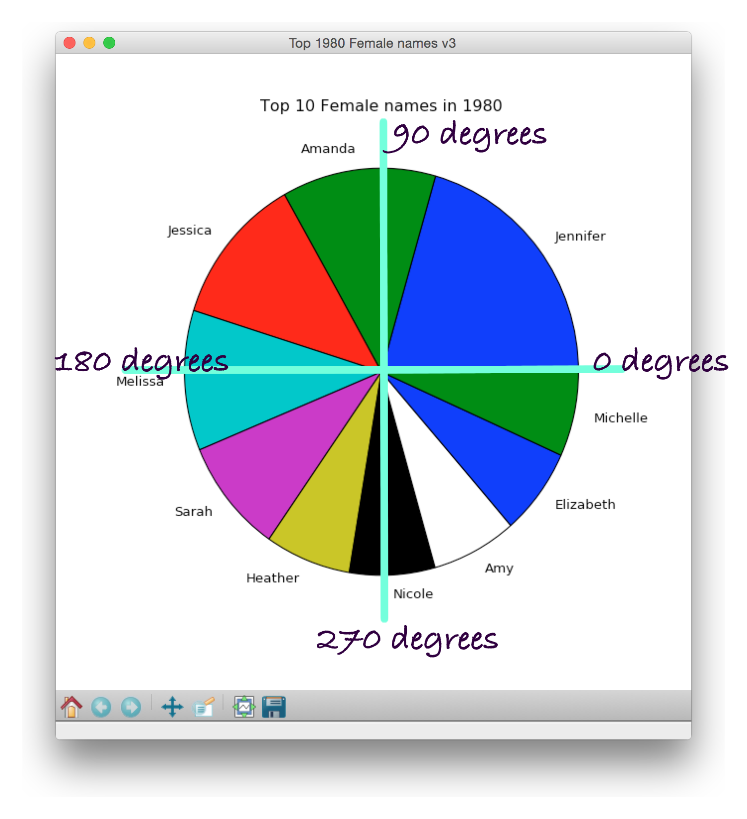
To customize this angle, utilize the startangle parameter when invoking pie():
plt.pie(count,
labels=names,
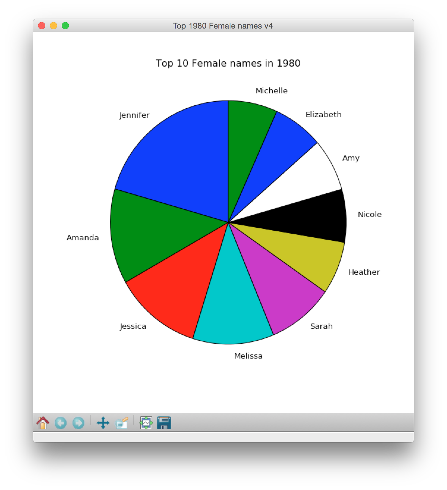
startangle=XX) # figure out what XX should beNow your plot should look like this:
Step 5. Colors in the pie chart
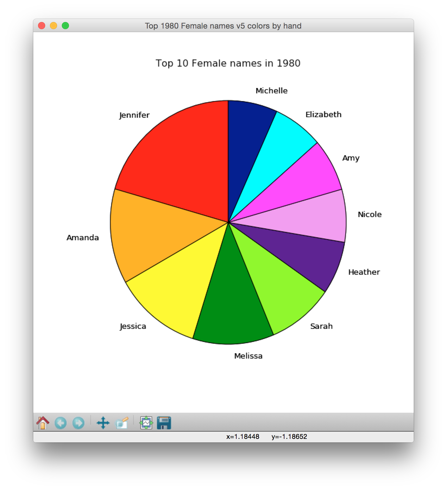
You can customize the colors of the slices in the pie by using the colors parameter when invoking pie(). You can do it by hand by creating a list of 10 colors, and then assigning the colors parameter to get the list of colors.
sliceColors = ['red','orange','yellow','green','chartreuse','indigo','violet','magenta','cyan','navy']
plt.pie(count, labels=names, startangle=90, colors=sliceColors)
Hand-coded colors:
However, assigning colors by hand doesn't generalize well (you often don't know in advance how many items you will be plotting) and we try to avoid hard-coding things in CS111.
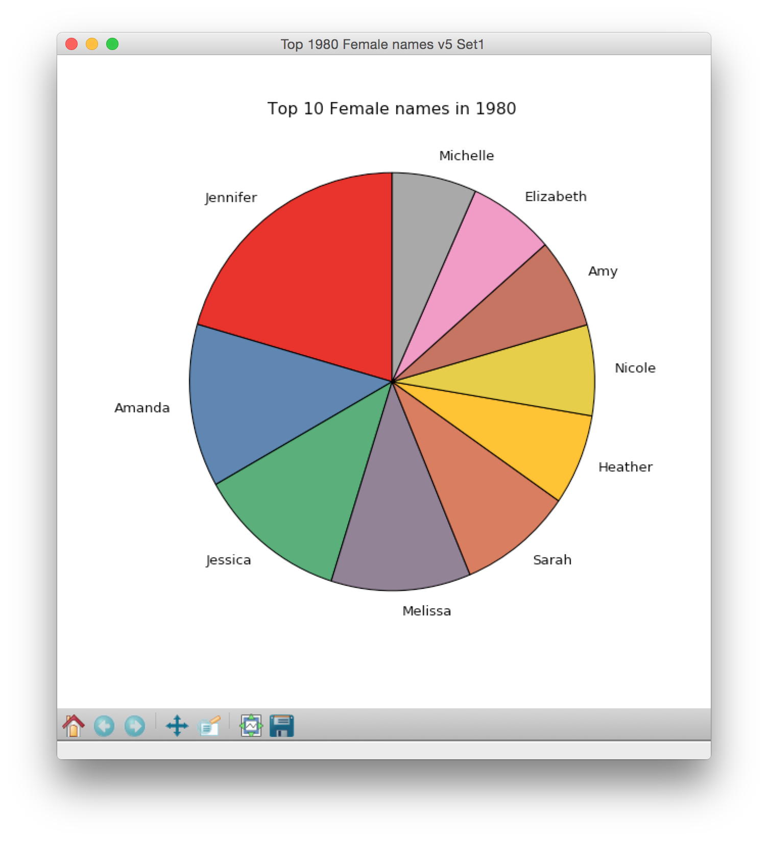
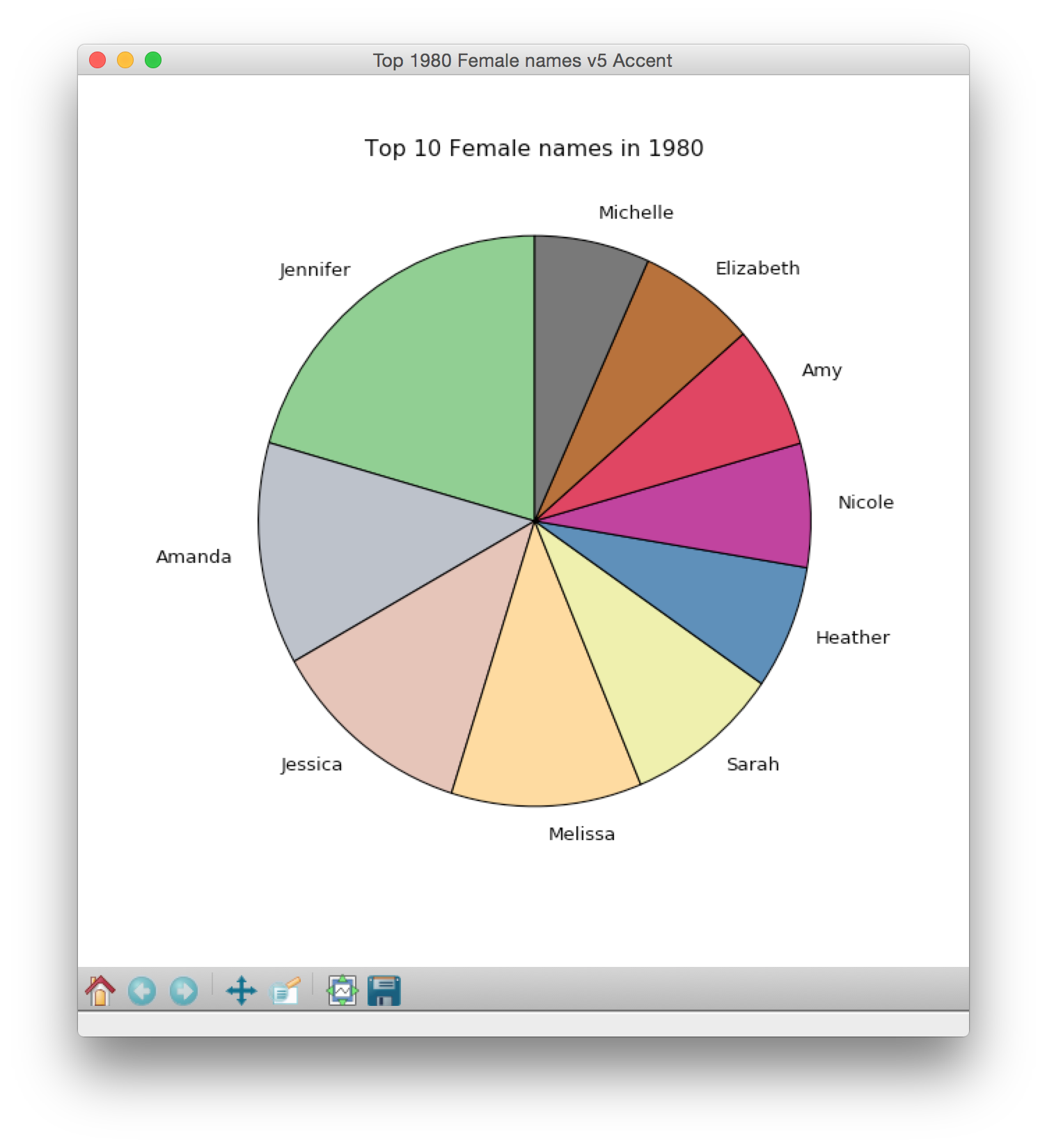
Alternatively, you can use colormaps, which are predefined sets of colors that are represented numerically. You can see a bunch of them at this pretty page. You can choose any colormap and use it for your pie chart. However, before using a colormap, you need to generate a list of colors that are pulled from the colormap.
# available colormaps: https://matplotlib.org/1.2.1/examples/pylab_examples/show_colormaps.html
colormap = plt.cm.Accent # Accent is the name of a colormap from page above
bunchOfColors = colormap(np.linspace(0., 1., len(names)))
linspace generates a list of evenly spaced numbers across a given interval.
bunchOfColors, then, is a list of list of colors that are pulled evenly from the given colormap. Click here to read linspace's documentation page.
Here is our pie chart with two different pre-defined colormaps:
Set1 colormap
Accent colormap
Step 6. Adding percentages to the pie chart
Although the pie chart gives a good visual representation of the ten most popular names, it can be helpful to add in the actual percentages of each name.
The pie() function has a parameter called autopct that does this automatically. So autopct calculates the relative percent of each pie slice and displays it on the pie chart. You only need to decide the level of precision to use to display the percentages.
plt.pie(........, autopct='%.2f')

# autopct='%.3f' # displays three decimal points, e.g. 3.241
# autopct='%.2f' # displays two decimal points, e.g. 3.24
# autopct='%.1f' # displays one decimal point, e.g. 3.2
# autopct='%.0f' # displays integers  e.g. 3
The plot below uses the Spectral colormap.
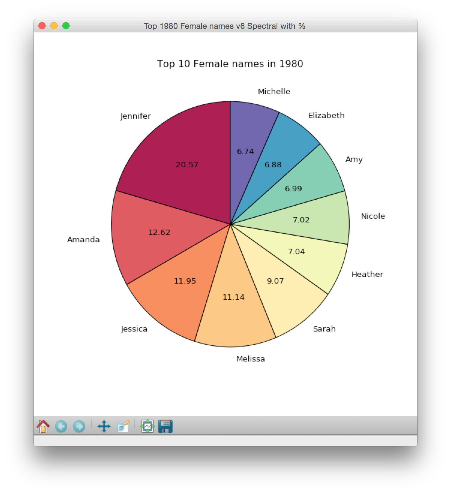
Wow, that's a lot of Jennifers! Of the female babies born in 1980 with names in the top 10, over 20% are named Jennifer!
We can also take a peek at some of the other data sets by making small changes to our code:
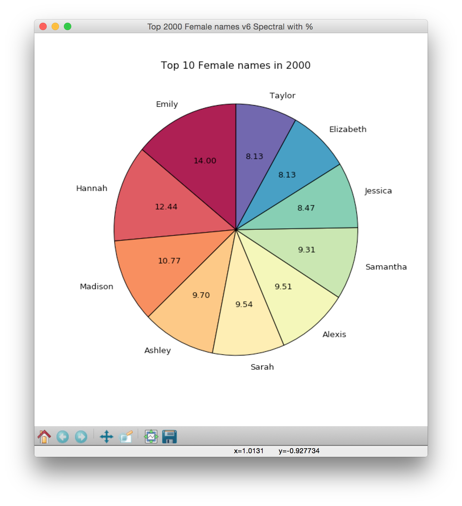
Top 10 2000 Female Names
Note that Sarah, Jessica and Elizabeth are in the top 10 for 1980 and 2000.
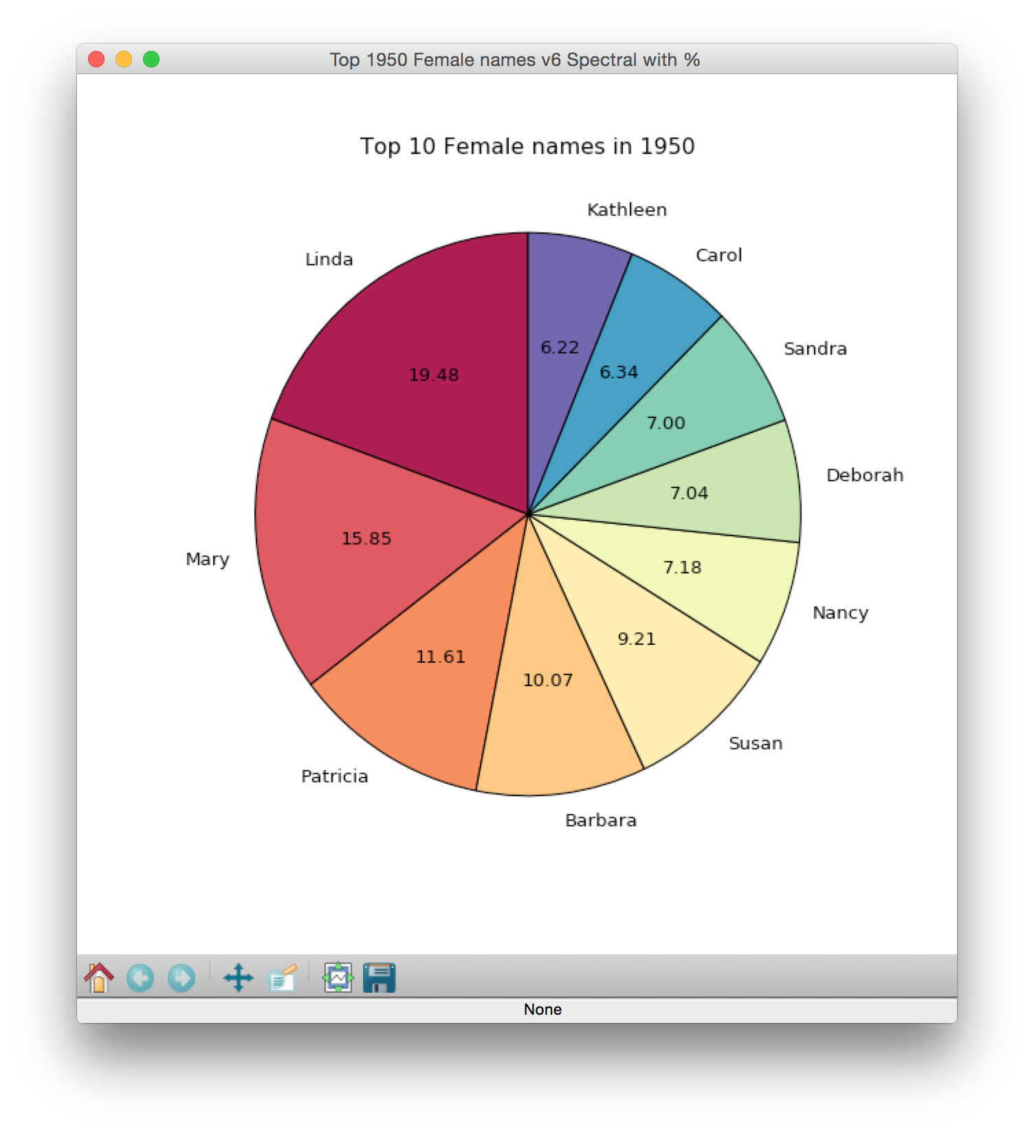
Top 10 1950 Female Names
Step 7. Saving the pie chart plot to a file
After generating a plot, we often want to save it to a file (to use the plot elsewhere). Note that the file will be saved in Canopy's working directory.
plt.savefig('1980TopFemaleNames.jpg')savefig writes the plot to a file called 1980TopFemaleNames.jpg. Go look in your plotting folder to verify that the file was created and that it contains the plot.
Table of Contents
- How to Plot Home
- Part 1: Intro to plotting
- Part 2: Baby name bar plots
- Part 3: Candy Power Rankings
- Part 4: Baby name pie charts
- Reference: matplotlib colors
- Reference: Simple bar chart examples
- Reference: How to make a pie chart
- Reference: Plotting examples