Bar charts
Reference
Preface
For all of the examples below, assume both numpy and pyplot have been imported:
import numpy as np
import matplotlib.pyplot as plt
Sample data
To demonstrate how to make bar charts, we're going to chart some sample data mapping students favorite candy.
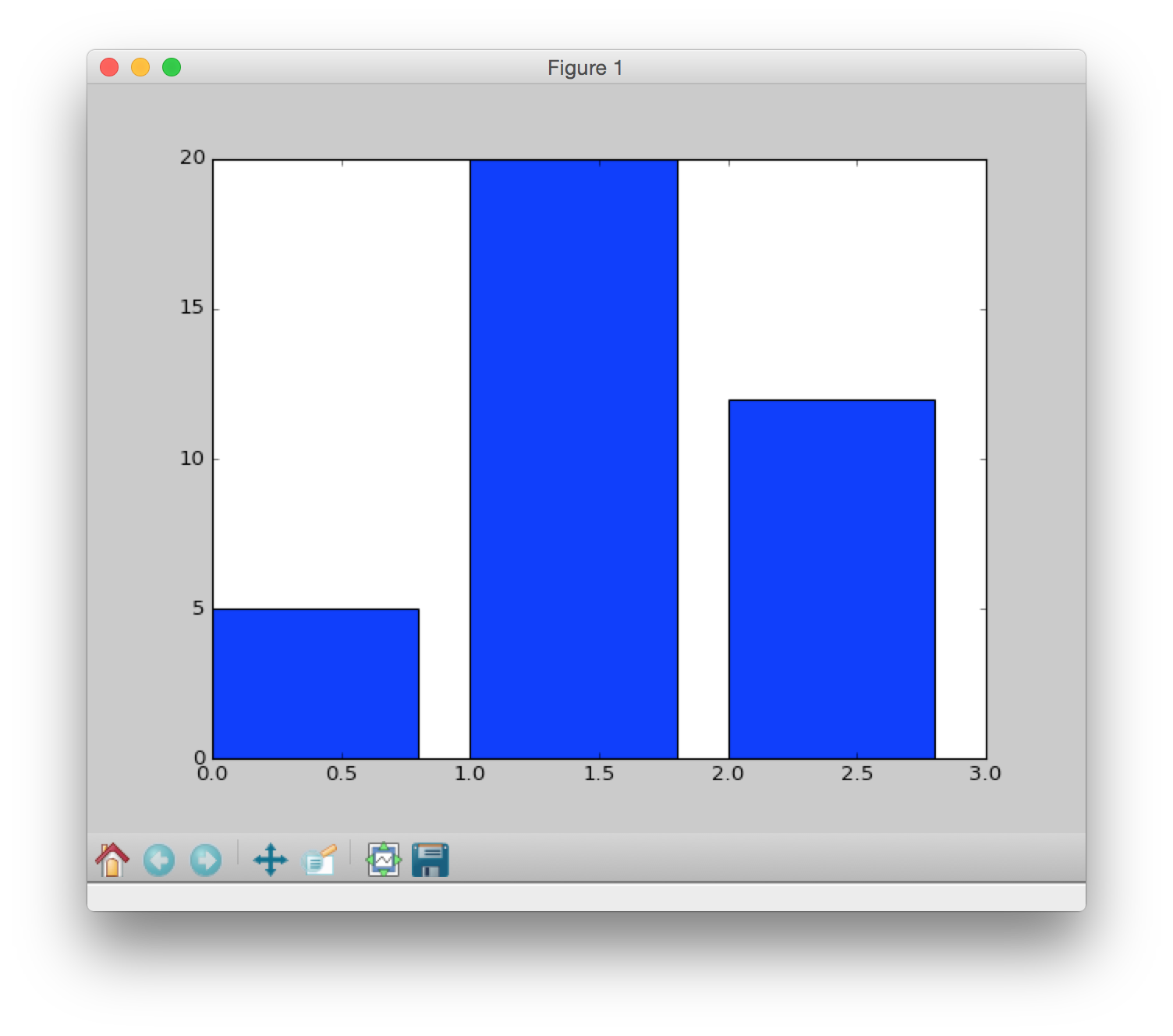
counts = [5,20,12]
candy = ["skittles","twizzlers","m&ms"]
Super simple bar chart Version 1.0
counts = [5,20,12]
candy  = ["skittles","twizzlers","m&ms"]

position = np.arange(len(counts)) # [0 1 2]

# Default color is blue, default width is 0.8

#          x        y
plt.bar(position,counts)

show()
Note there are no labels in this example, just the bars of height 5, 20, and 12.
We essentially plotted [0,1,2] against [5,20,12].
Super simple bar chart Version 2.0
counts = [5,20,12]
candy  = ["skittles","twizzlers","m&ms"]

position = np.arange(len(counts)) # [0 1 2]

# New width, color and alignment of bars
plt.bar(position, counts, width=0.5, color='green', align='center')

plt.show()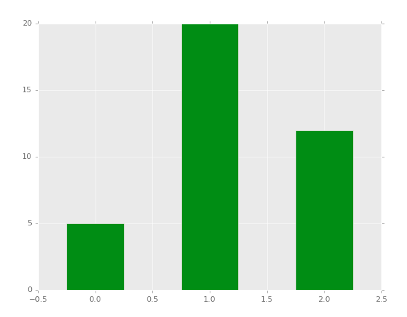
In this example we changed the color, width and placement of the bars (all in the bar() function)
Super simple bar chart Version 3.0
counts = [5,20,12]
candy  = ["skittles","twizzlers","m&ms"]

position = np.arange(len(counts)) # array([0,1,2])

plt.bar(position,counts,width=0.5,color='green',align='center')

plt.xticks(position,candy) # added labels to x-axis

plt.title('Candy votes') # added title

plt.show()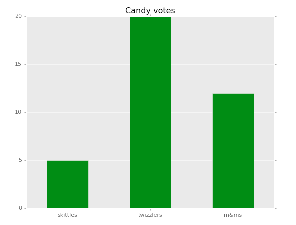
In this example we added labels by using plt.xticks and a title using plt.title.
A more complex bar chart
# Made up data:
data  = [79,83,92,43,64,78,85,93]
names = ["AB","BG","KG","CW","WE","GD","TM","OL"]

grid(True) # background grid visible

# `arange()` is like range but returns an array
# and works for floating point numbers
position = np.arange(len(data))

plt.bar(position, data, width=0.5, color='darkolivegreen', align='center')

xticks(position,names) # Marks on x-axis

title('Sample bar chart') # Title of bar chart

plt.show()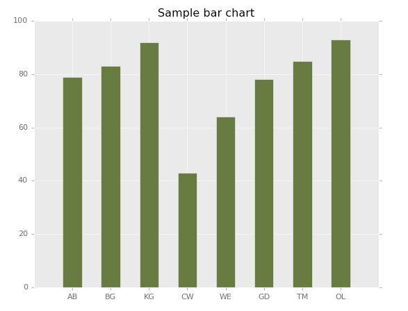
A horizontal bar chart
All of the above examples used bar() which creates a vertical bar chart. To make a horizontal bar chart, use barh().
Example:
counts = [5,20,12]
candy  = ["skittles","twizzlers","m&ms"]

position = np.arange(len(candy))

plt.barh(position,counts,0.5,align='center')

plt.yticks(position,candy) # Marks on x-axis

plt.show()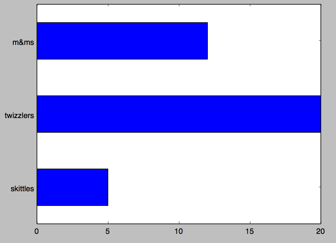
Table of Contents
- How to Plot Home
- Part 1: Intro to plotting
- Part 2: Baby name bar plots
- Part 3: Candy Power Rankings
- Part 4: Baby name pie charts
- Reference: matplotlib colors
- Reference: Simple bar chart examples
- Reference: How to make a pie chart
- Reference: Plotting examples