How to make a pie chart (ice cream)
We will need to import pyplot to make pie charts:
import matplotlib.pyplot as plt
import numpy as np
Pie Charts
To create a pyplot pie chart, you'll need two lists:
- (required) A list of numbers indicating the size of each pie slice.
- (optional) A list of labels for those slices
icecreamPreferences = [30,50,10,6] # fyi: does not have to sum to 100
iceCreamLabels = ['Strawberry', 'Chocolate', 'Vanilla','Banana']
Those two lists can then be passed to the pie() function:
# Setting the figure size is important-
# without it, you'll get a squished pie chart (no one likes squished pie)
plt.figure('Pie Chart Example', figsize=(4,4), facecolor='white')

plt.pie(icecreamPreferences,labels=iceCreamLabels)

plt.show()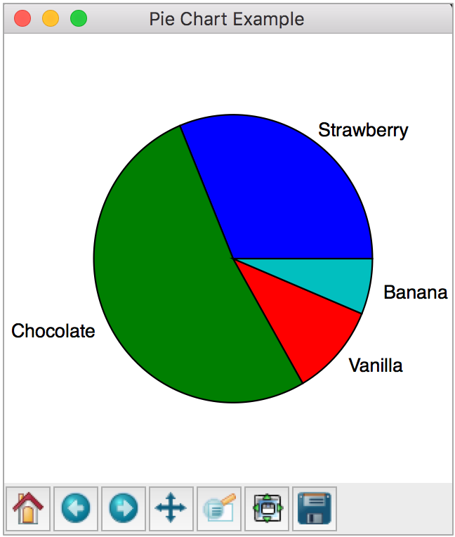
Colors
To customize the colors of your slices, add the colors parameter when invoking pie() and pass it a list of colors:
sliceColors = ['pink', 'chocolate', 'ivory','yellow']
plt.pie(icecreamPreferences,labels=iceCreamLabels,colors=sliceColors)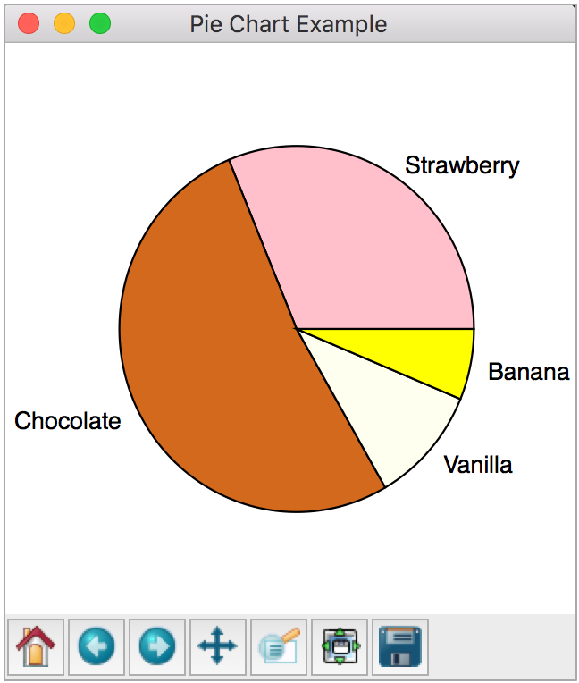
In our ice cream flavor examples, the colors we choose are important because they match the flavors.
In some pie charts though, the color won't matter, just as long as there is a variety. In these cases, you can create a list of colors using pyplot's colormap feature.
Example:
colormap = plt.cm.Set2
numberOfSlices = len(icecreamPreferences)
sliceColors = colormap(np.linspace(0., 1., numberOfSlices))

# Example resulting sliceColors list:
# [[ 0.40000001  0.76078433  0.64705884  1.        ]
# [ 0.67058825  0.59869283  0.78562093  1.        ]
# [ 0.88366014  0.84967321  0.23267974  1.        ]
# [ 0.7019608   0.7019608   0.7019608   1.        ]]
Start angle
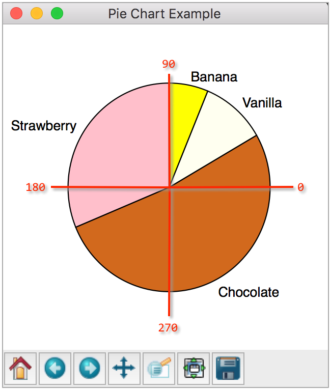
By default, your pie chart starts at 0 degrees (red lines added to show degrees):
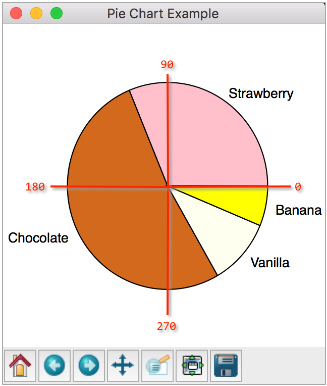
To customize this angle, utilize the startangle parameter when invoking pie():
plt.pie(
    icecreamPreferences,
    labels=iceCreamLabels,
    startangle=90
    )
Displaying percentages on slices
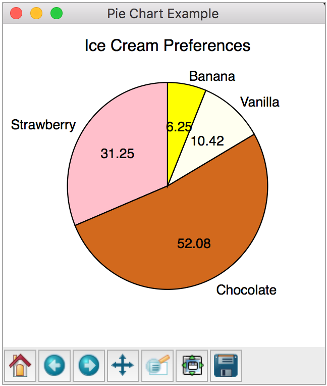
Our pie chart is created using these slices:
icecreamPreferences = [30,50,10,6]The sum of these 4 values is 96.
So each slice size is determined by a fraction of that:
- Slice 1: 30/96 = 31.25%
- Slice 2: 50/96 = 52.08%
- Slice 3: 10/96 = 10.42%
- Slice 4: 6/96 = 6.25%
To label each slice with its percentage, add the autopct parameter when invoking pie().
To customize how the percentage values are displayed, set autopct to a format string such as as %.2f which will display the percentages as a floating point number (f) with 2 decimals (.2).
plt.pie(
    icecreamPreferences,
    labels=iceCreamLabels,
    colors=sliceColors,
    startangle=90,
    autopct='%.2f'
    )
Full example
import matplotlib.pyplot as plt

# Set up data for the pie chart...
icecreamPreferences = [30,50,10,6] # does not have to sum to 100
iceCreamLabels      = ['Strawberry', 'Chocolate', 'Vanilla','Banana']

# Make the pie chart...
# facecolor is the background color of the canvas
# figsize controls the (x, y) dimensions of the plot
plt.figure('Pie Chart Example', figsize=(4,4), facecolor='white')

plt.title("Ice Cream Preferences")

sliceColors = ['pink', 'chocolate', 'ivory','yellow']
plt.pie(
    icecreamPreferences,
    labels=iceCreamLabels,
    colors=sliceColors,
    startangle=90,
    autopct='%.2f'
    )

plt.show()
Fancy extras: changing text color of percents and labels
Let's say you wanted to change the color of the text of the percent labels and the text labels of each slice. You can do that.
It turns out the plt.pie returns a tuple of three pieces of information: wedges, text, and sliceText. If you save that tuple of information, then you can change the color as you like.
wedges, text, sliceText = plt.pie(
    icecreamPreferencespbp,
    labels=iceCreamLabels,
    colors=sliceColors,
    startangle=90,
    autopct='%.2f'
    )
Let's take a closer look at that tuple:
wedges: the pie slices (we are not going to change anything with the wedges)text: text labels outside the pie (eg. Vanilla, Chocolate, etc)sliceText: text that labels the percent of each slice (eg. 10.42, 52.08, etc)
for t in text:
   t.set_color('magenta')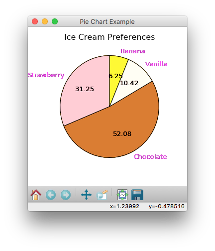
changes the color of the numerical labels (see below):
for s in sliceText:
   s.set_color('deepskyblue')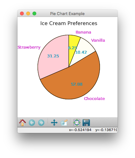
Table of Contents
- How to Plot Home
- Part 1: Intro to plotting
- Part 2: Baby name bar plots
- Part 3: Candy Power Rankings
- Part 4: Baby name pie charts
- Reference: matplotlib colors
- Reference: Simple bar chart examples
- Reference: How to make a pie chart
- Reference: Plotting examples