Data visualization of names
We'll start today's lab by reviewing some functions from our last lecture, so that eventually you can plot a name's popularity over time.To set up for today's lab, you'll need to download the
lab7_programs folder from the cs111 download folder.
Note that there is a names subfolder inside containing a bunch of names
files. Make sure that any python programs that you write are also
saved inside your lab7_programs folder, but outside the
names folder.
Technical note: pop-up plot windows
Running your plotting code in Canopy places your plots in the inline python window. It's preferable to have your plots pop up in a separate window. Here's how to do that:- Canopy > Preferences
- Click on the python tab
- In the PyLab backend drop-down menu, select Interactive (wx)
(see image below). This allows for pop-up plot windows.
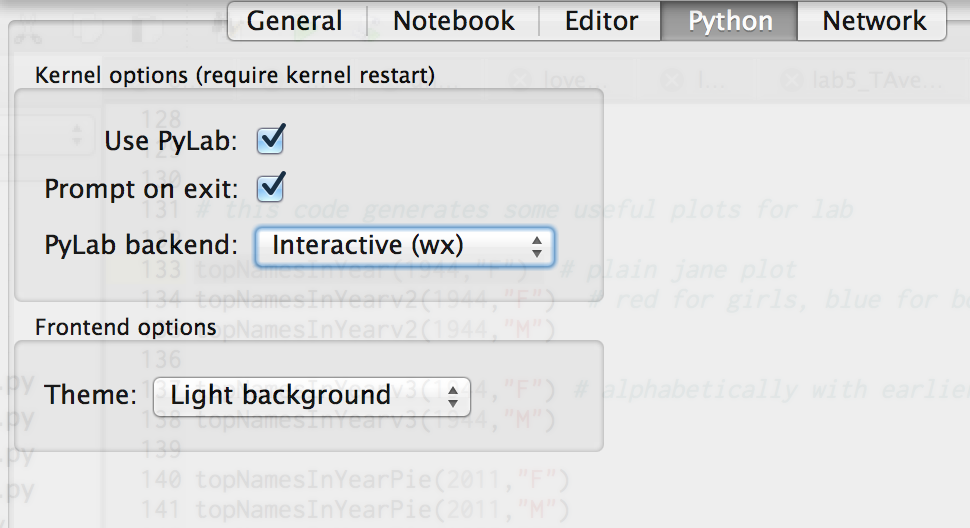
- If the PyLab backend drop-down menu has Inline (SVG), then the plots will show up in the inline Python window (that's not what we want).
Some useful techniques from lecture
In Lecture 11 (click here for notes), the functiongetNameDictionary() below was defined:
def getNameDictionary(year, sex):
    '''Reads in SSA data for the given year and, for the specified sex,
    returns a dictionary mapping firstNames to their rank.'''
    # For example,say year is 1996, then filename is yob1996.txt
    filename = 'names/yob' + str(year) + '.txt'
    file = open(filename)
    lines = file.readlines()  #e.g., all lines inside yob1996.txt
    nameDictionary = {} # a new, empty dictionary
    rank = 1 # Start with #1 ranked name
    for line in lines:  # for every name in the file
        splitLine = line.strip().split(',')  # Comma separated line
        if splitLine[1]==sex:
            nameDictionary[splitLine[0]] = rank
            rank += 1
    file.close()
    return nameDictionary
Recall that getNameDictionary returns a dictionary.
The names folder contains a bunch of files such as
yob2013.text that look like this:
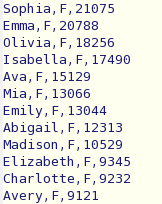
This image is intended to provide a visual for part of what
getNameDictionary() does:

Here's a peek at a dictionary generated from the year 2013 for females
(remember that dictionaries are not ordered) from this invocation
getNameDictionary(2013, 'F'):
{'Emily':7,
 'Chloe':14,
 'Derrion':15001,
 'Magda':8789,
 'Sanjida':18658,
 'Dulce':556,
 'Ivett':12346,
 'Yaniece':19002,
 'Mckenzi':2455,
  ...
}
In lecture, you also defined
getListOfRanksForName(firstname, sex, startyear, endyear) and
plotRanksForName(firstname, sex,
startyear, endyear)
.
Click here for the code for those two functions. Here are some examples of these two functions in action:
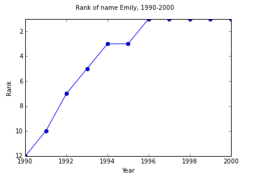
Emilylistranks = getListOfRanksForName('Emily','F',1990,2000)

In [59]: Emilylistranks
Out[59]: [12, 10, 7, 5, 3, 3, 1, 1, 1, 1, 1]

In [60]: plotRanksForName('Emily','F',1990,2000)
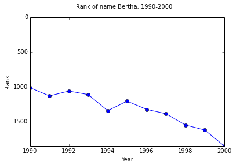
Berthalistranks = getListOfRanksForName('Bertha','F',1990,2000)

In [61]: Berthalistranks
Out[61]: [1015, 1133, 1063, 1114, 1345, 1208, 1326, 1388, 1550, 1622, 1850]

In [62]: plotRanksForName('Bertha','F',1990,2000)
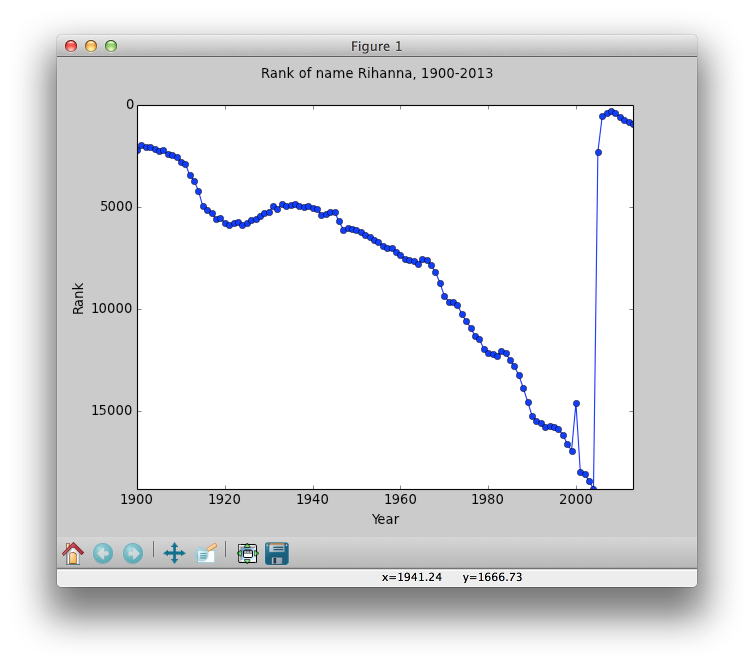
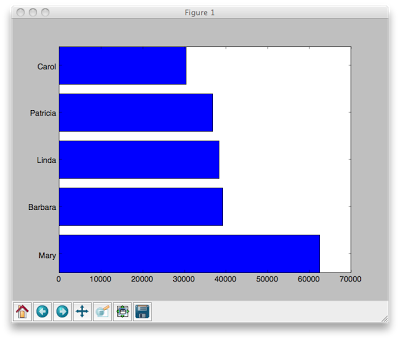
These functions are included here because they are relevant to the code you will be writing today. Task 0. Plot your name ranking from 1900 to 2013. Note: if your name is not in the database (there must be at least 5 babies with the same name in order to be part of the Social Security database), then choose another name to plot. Here is an example plot of the name Rihanna:
Create bar graphs of the most popular names in a given year for a given sex
Task 1a. Write a function calledtopNamesInYear()
that produces a bar chart of the top names in a given year for a given sex.
There are many ways to approach the task of writing
topNamesInYear(year, sex, numberOfTopNames).
First, we will focus on extracting the relevant data, and then worry about bar charts later.
For extracting the relevant data, we can adapt the techniques used in getNameDictionary above to write some useful helper functions.
Task 1a: Helper functions: getRankedListOfNames()
and getRankedListOfCounts()
Here are two suggested helper functions:
getRankedListOfNames() reads in the SSA baby name data for the given year and, for the specified sex, returns a list of firstNames in order by rank. For example,
In[10]: rankedNames2000 = getRankedListOfNames(2000,'F')

In[11]: len(rankedNames2000)
Out[11]: 17650

In[12]: rankedNames2000[:10]
Out[12]:
['Emily',
 'Hannah',
 'Madison',
 'Ashley',
 'Sarah',
 'Alexis',
 'Samantha',
 'Jessica',
 'Elizabeth',
 'Taylor']

In[13]: rankedNames2000[-10:]
Out[13]:
['Zorya',
 'Zoye',
 'Zsazsa',
 'Zyah',
 'Zyaira',
 'Zykeia',
 'Zykeriah',
 'Zykiera',
 'Zyonna',
 'Zyra']
Now, let's think about the counts of each name.
getRankedListOfCounts() reads in the SSA baby name data for the given year and, for the specified sex, returns a list of counts in order by rank. For example,
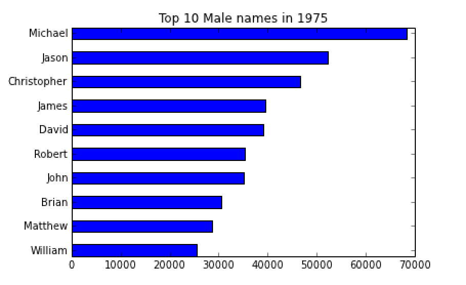
In[50]: countlist = getRankedListOfCounts(2000,'F')

In[51]: countlist[:10]
Out[51]: [25951, 23068, 19966, 17993, 17680, 17626, 17263, 15701, 15081, 15078]

In[52]: countlist2 = getRankedListOfCounts(1975,'M')

In [53]: countlist2[:10]
Out[53]: [68447, 52191, 46576, 39584, 39163, 35332, 35092, 30598, 28550, 25578]
The data above mean that, in the year 2000, there were 25951 female babies named Emily (the top-ranked name), 23068 babies named Hannah, 19966 named Madison, etc. And for the men's names in 1975, Michael (count of 68447) is the #1 name, followed by Jason (52191) and Christopher (46576) at #2 and #3, respectively.
Now, once you have getRankedListOfNames()
and getRankedListOfCounts() working properly, then you
can use those to write topNamesInYear(). The first step
should be to generate the list of the top names and the list of the top counts, and then plot them in a bar chart. Remember that the user can specify exactly how many top names/counts are to be plotted.
Here is what your first bar graph might look like:
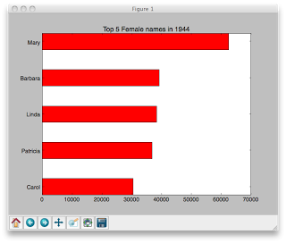
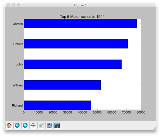
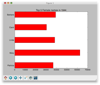
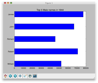
topNamesInYear(1944,'F',5)
range() and arange()
We now have two options for generating sequences of evenly spaced numbers (which is handy when making charts).
Remember our friend range(), often used with for loops, generates a list of integers:
    range(4) ==> [0,1,2,3]
    range(10,20) ==> [10,11,12,13,14,15,16,17,18,19]
    range(2,15,3) ==> [2,5,8,11,14]
    home_on_the = range(5)
    type(home_on_the) ==> list
There is a similar function called arange() (part of pylab), that also generates a sequence
of numbers, but stashes the numbers in an array (which, like a list, can be indexed and sliced).
arange allows you to generate non-integer sequences of numbers, like this:
    arange(4) ==> array([0,1,2,3]) # just like range
    arange(4.0) ==> array([ 0.,  1.,  2.,  3.]) # floating point numbers
    arange(5, dtype='float') ==> array([ 0.,  1.,  2.,  3.,  4.])
    myNumbers = arange(2,7,dtype='float') # dtype sets the data type
    myNumbers[1:3] ==> array([3., 4.])
    myNumbers[1.7:4.6] ==> array([ 3.,  4.,  5.]) # rounds the 1.7 to int and 4.6 to 4
In all the examples below with bar charts, we
use arange(), mostly because with charts it is often
convenient to be able to generate sequences of floating point numbers
and to slice them as needed.
How to make a bar chart
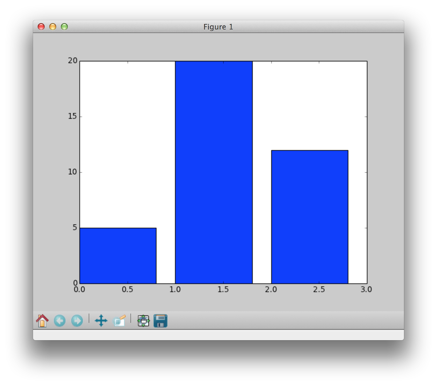
Your goal is to create a bar graph of the name data. Below are some incremental examples that show how to make a bar chart. Let's say that we asked a group of students which candy they liked most: skittles, twizzlers or m&ms.Super simple bar chart Version 1.0
counts = [5,20,12]
candy = ["skittles","twizzlers","m&ms"]
# arange returns an array of numbers like this [0,1,2]
position = arange(len(counts))
 # default color is blue, default width is 0.8
bar(position,counts)
show()
Note: There are no labels here, just the bars of height 5, 20 and 12. We essentially plotted [0,1,2] against [5,20,12].
Super simple bar chart Version 2.0
counts = [5,20,12]
candy = ["skittles","twizzlers","m&ms"]
position = arange(len(counts))  # array([0,1,2])
# new width, color and alignment of bars
bar(position,counts,width=0.5,color='green',align='center')
show()
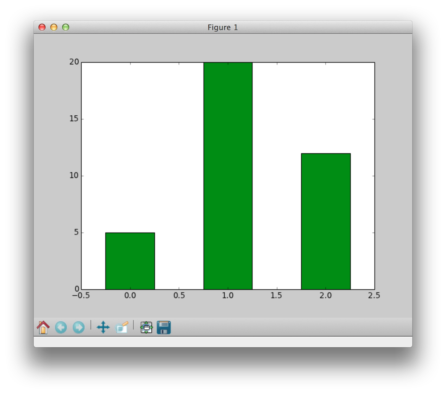
Note: We changed the color, width and placement of the bars (all in the bar() function).
Super simple bar chart Version 3.0
counts = [5,20,12]
candy = ["skittles","twizzlers","m&ms"]
position = arange(len(counts))  # array([0,1,2])
bar(position,counts,width=0.5,color='green',align='center')
xticks(position,candy)    # added labels to x-axis
title('Candy votes')    # added title
show()
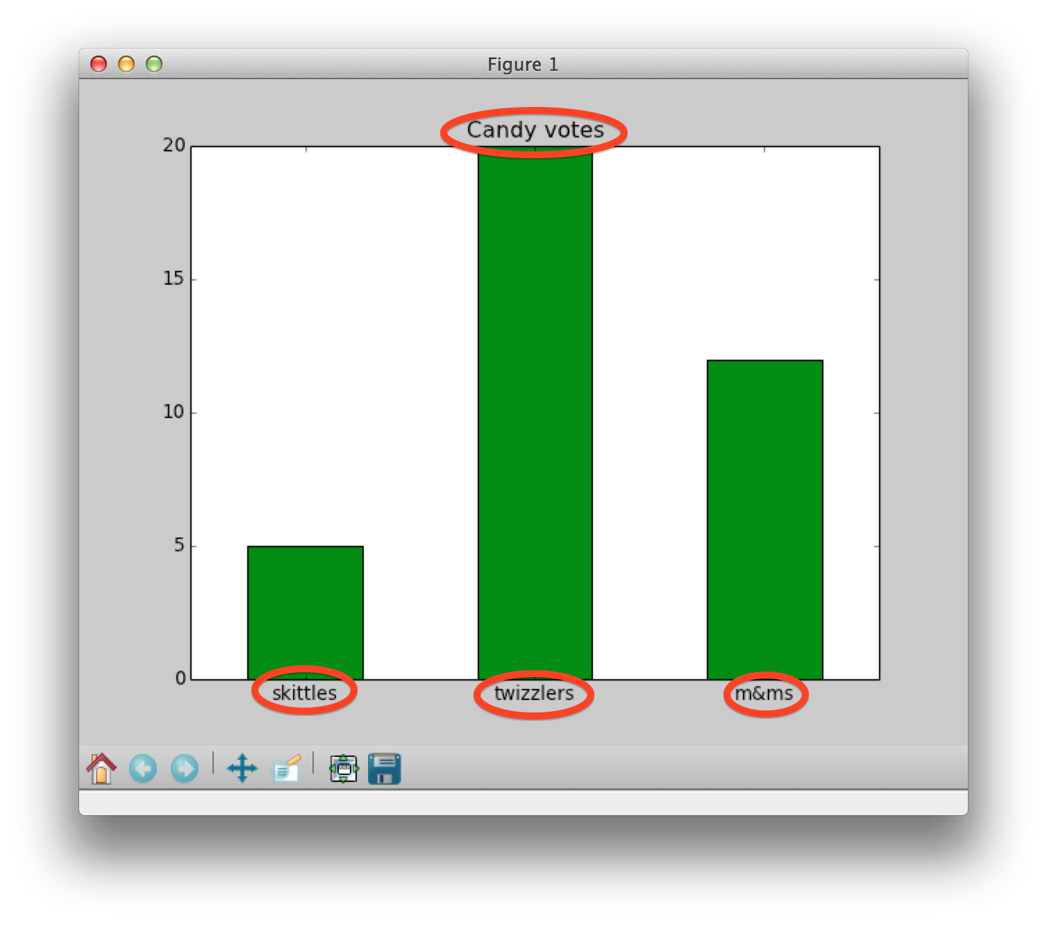
Note: We added labels by using
xticks(position,candy) and a title using title
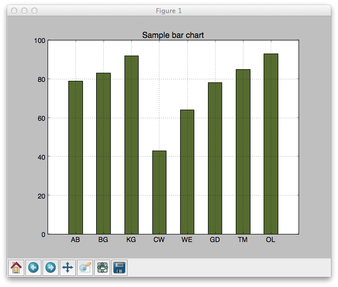
A more complex bar chart example
# Sample code showing how to make a generic bar graph with fake data
from pylab import *
data = [79,83,92,43,64,78,85,93] # Made up data
names = ["AB","BG","KG","CW","WE","GD","TM","OL"] # Made up data
grid(True) # background grid visible
# arange is like range but returns an array and works for floating point nums
position = arange(len(data))
bar(position,data,width=0.5,color='darkolivegreen',align='center')
xticks(position,names)# Marks on x-axis
title('Sample bar chart')# Title of bar chart
show()#Show the plot
- Add a title to your plot that includes the sex
- Change the thickness of the bars
- Plot the names with the most frequently occurring name on top (as shown below)
- Color code the bars (one color for females, another one for males)
- Note that
barh()draws a horizontal bar chart (andbar()draws a vertical bar chart. - When using
barh()and specifyingwidth, remove the "width=" part, like this:barh(position,data,0.5)
|
|
sorted function.
|
|
Task 1d. Display the data in pie chart rather than bar chart format
Sample pie chart example
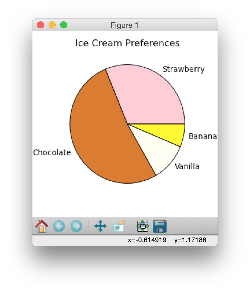
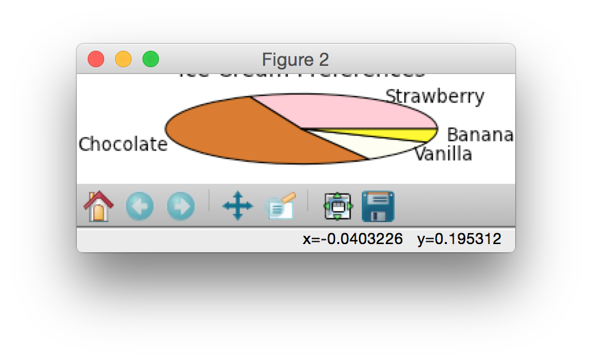
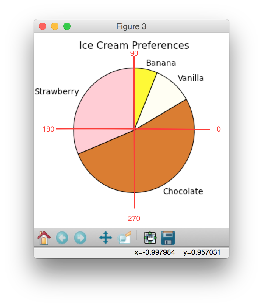
Here's a really simple pie chart example to get you started. Copy and paste it into a new file in Canopy.from pylab import * # allows plotting # facecolor is the background color of the canvas figure (1, figsize=(4,4),facecolor='white') # figsize controls the (x, y) dimensions of the plot icecream = [30,50,10,6] # do not have to sum to 100 title("Ice Cream Preferences") mycolors=['pink', 'chocolate', 'ivory','yellow'] mylabels=['Strawberry', 'Chocolate', 'Vanilla','Banana'] # pie makes the pie chart pie(icecream,labels=mylabels,colors=mycolors) show() # make the plot visible
See how the strawberry starts at the 0 degree location and the flavors move counterclockwise? This is the default for pie charts.
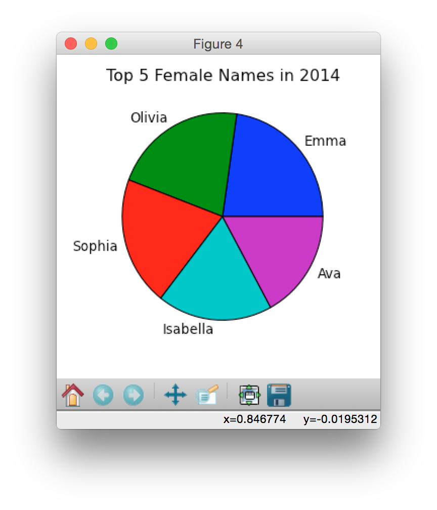
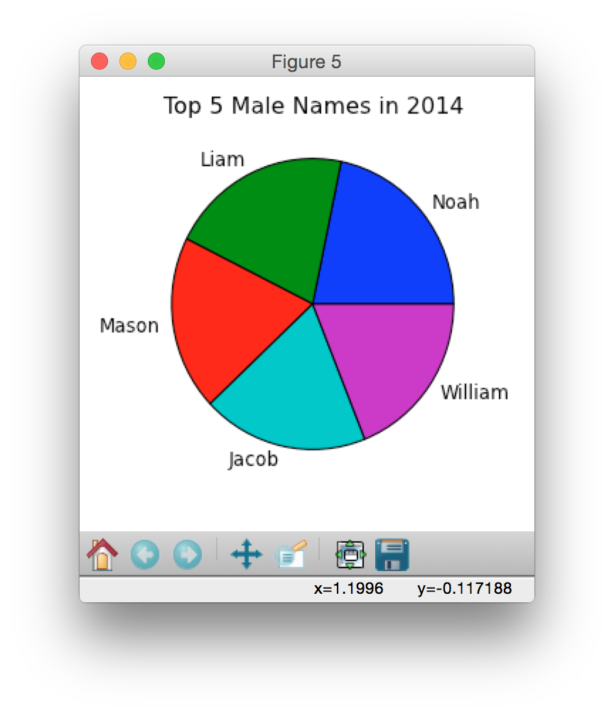
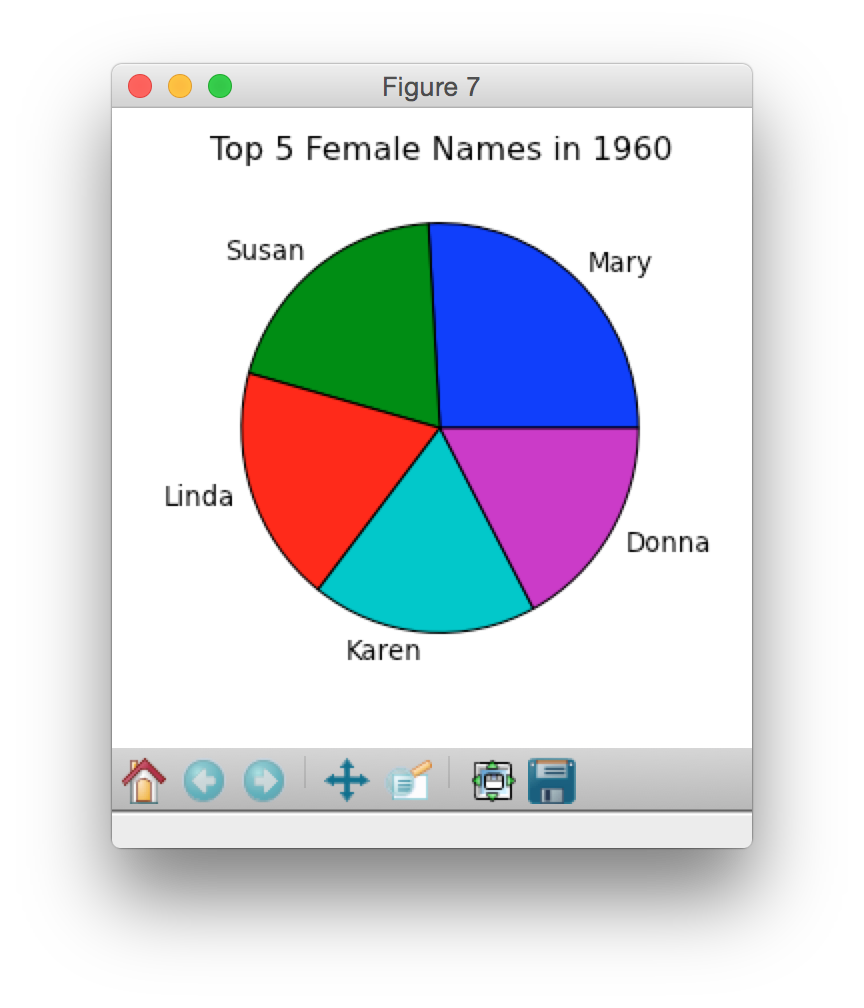
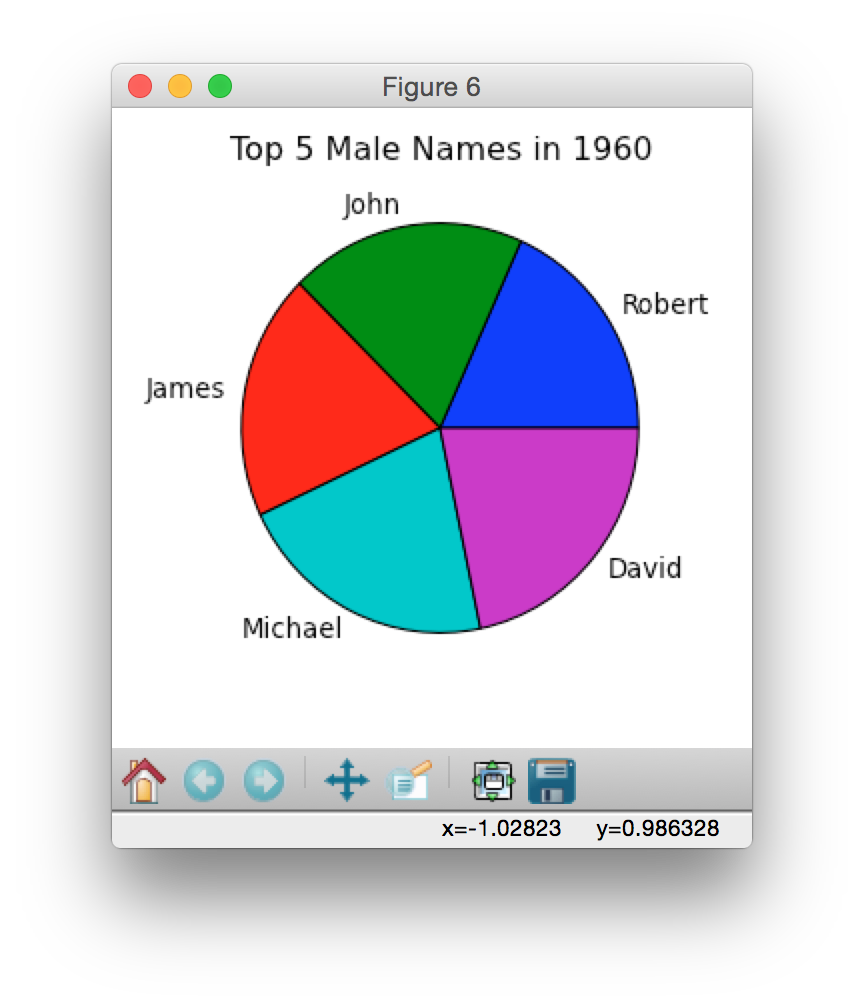
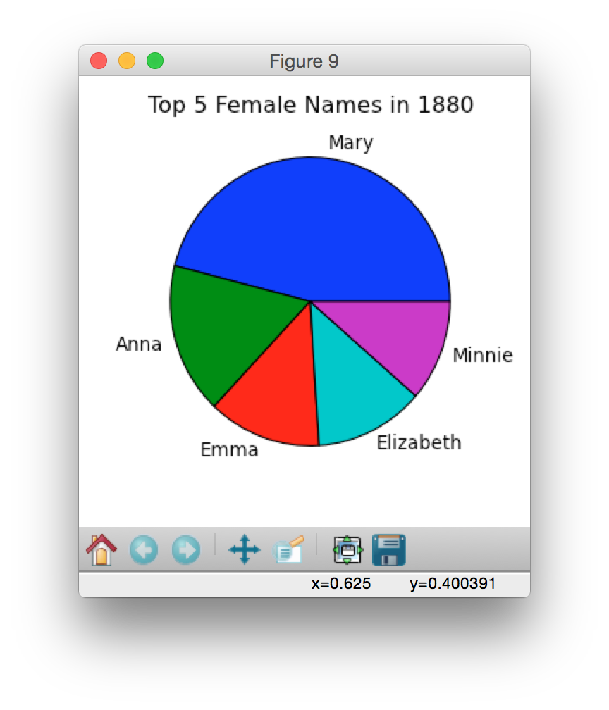
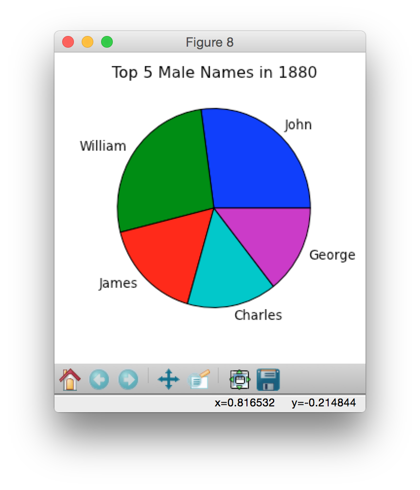
Below are some sample pie charts generated using data from 2014, 1960 and 1880:
|
|
|
|
|
|
Task 2. Create a dictionary where each key maps to a list (seating chart) In your
lab7_programs folder, there is a file called
roster.txt. Here is a snapshot of what roster.txt looks like:
Clinton,Hillary,row2
Albright,Madeleine,row1
Sawyer,Diane,row3
Melroy,Pamela,row1
Shue,Elizabeth,row3
Drell,Persis,row3
Ephron,Nora,row3
...
This file includes the name of every student in a fictional class, plus the row where they typically sit during class. In this task, you'll read in the text file and then use it to create a dictionary where the keys are the classroom rows (e.g. 'row1','row2', and 'row3') and the values are lists of students who typically sit in those rows.
Below is a template to get you started.
def makeSeatingDict():
   # create your new empty dictionary

   # set up a list of the rows in the classroom
   # These will be the keys of your new dictionary
   e101 = ['row1','row2','row3']
   # initialize each key in your dictionary to have an empty list

   file = open("roster.txt",'r')
   # read in all lines of the text file

   # for each line in the text file, separate it by the commas and ignoring whitespace and then update your dictionary by storing the student's first name
as a value that corresponds to the key row value.


   file.close()
   # close the opened file
   # return your dictionary
After running your function makeSeatingDict(), you should produce a dictionary that looks like this (the order of the names may vary slightly):
{'row1': ['Madeleine','Pamela','InHo','Cokie','Lynn'],
 'row2': ['Hillary','Judith','Linda','Marian'],
 'row3': ['Diane','Elizabeth','Persis','Nora']}
Create bar graphs of the frequencies of the last letters of names
Task 3a. Create a function called lastLetterNames that will return a dictionary with keys being each letter in the alphabet, and values being a list of the names that end with that letter.For example,
lastLetNames1994F = lastLetterNames("F",1994)
will generate a dictionary where each key (a letter in the alphabet)
corresponds to a list of names ending with that letter. Reminder:
it's always a good idea to start testing your functions on a smaller
data set first, then graduate to the actual data. You can use
yob2012.txt from last lecture if you like.
For example, lastLetNames1994F["b"] results in:
['Zainab','Jacob','Zeinab','Zaynab','Caleb','Kaleb','Zaineb',
'Nayab','Mahtab','Zenab']
and lastLetNames1994F["j"] results in:
['Semaj', 'Cj', 'Taj', 'Areej', 'Dj']Task 3b. Create a function called
lastLetterPcts
that returns a dictionary of last letter percentages for names of
given sex in a given year.
Hint: you can use the dictionary created
by lastLetterNames in order to calculate percentages.
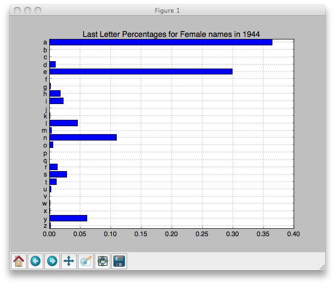
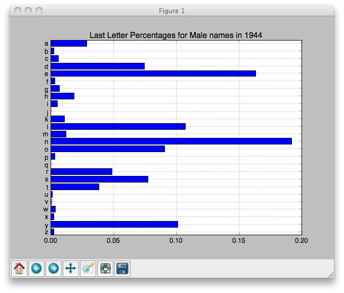
lastLetPcts1944M = lastLetterPcts("M", 1944)
lastLetPcts1944M contains the following dictionary (which is plotted below in Task 3c):
{'a': 0.028651829112304936,
 'b': 0.0023023791250959325,
 'c': 0.00588385776413405,
 'd': 0.07444359171143515,
 'e': 0.1634689178818112,
 'f': 0.00332565873624968,
 'g': 0.006907137375287797,
 'h': 0.018674852903555896,
 'i': 0.005116398055768739,
 'j': 0.0,
 'k': 0.010744435917114352,
 'l': 0.10718853926835507,
 'm': 0.012279355333844973,
 'n': 0.19212074699411613,
 'o': 0.09056024558710668,
 'p': 0.00332565873624968,
 'q': 0.0,
 'r': 0.04860578152980302,
 's': 0.07725761064210795,
 't': 0.03811716551547711,
 'u': 0.0012790995139421847,
 'v': 0.00025581990278843696,
 'w': 0.003581478639038117,
 'x': 0.0025581990278843694,
 'y': 0.10104886160143259,
 'z': 0.0023023791250959325}
Task 3c. Write a function to plot a bar chart of the last letter frequency information of a given year and given sex.